Root Markets: Sketch Five
The first in a series of interactive sketches that explore different ways of presenting browser history data.
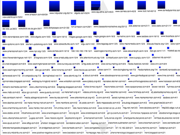
Squares represent the number of clicks to each domain a set of data; one click = one pixel (of the length of each side of the square). Color bands in a square represent unique pages accessed within the domain. Roll over a band to see the URL of the page it represents. The label below each square shows the domain along with the number of clicks and unique pages it contains. Limited to the 2500 most recent clicks. Click and drag to scroll.
- (Link disabled, because the sketch required Flash)

Root Markets: Sketch Seven
The second in a series of interactive sketches that explore different ways of presenting browser history data.
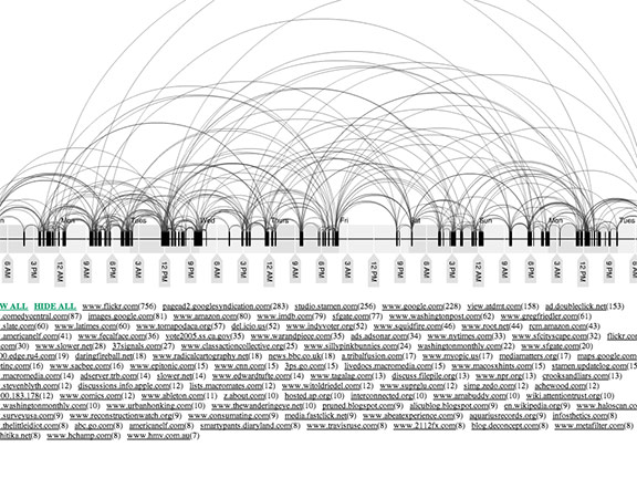
A timeline with arcs connecting all the clicks of a portion of the most-visited hosts. Limited to the past 10 days worth of clicks. Click the links below the timeline to hide and show arcs.
- (Link disabled, because the sketch required Flash)

Root Markets: Sketch Nine
The third in a series of interactive sketches that explore different ways of presenting browser history data.
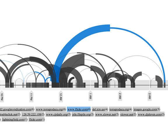
Similar to the previous piece, except that visits have been re-defined as multiple clicks to the same domain within a time span (now 10 minutes) even if clicks to other domains happen in between. This means that page visits can overlap. Click the links below the timeline to hide and show arcs. Roll over the links or the arcs to identify them.
- (Link disabled, because the sketch required Flash)

Root Markets: Sketch Eleven
The fourth in a series of interactive sketches that explore different ways of presenting browser history data.
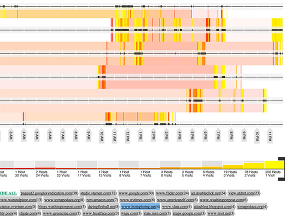
This one stacks daily timelines, and allows you to choose the range of hosts you want displayed. Drag the brackets to set the display range. Click the links below the timelines to hide and show visits. Roll over the links to highlight visits.
- (Link disabled, because the sketch required Flash)